RevenueHero (Speculative Redesign)Visual & BrandingProduct Design

RevenueHero: Landing Page Redesign with Motion

How I redesigned RevenueHero's landing page and ads to increase demo requests—featuring Lottie animations, mobile-first UX, and conversion-driven layout changes.

3

Tasks Completed

4

Lottie Animations Created

2 sets × desktop + mobile

Ad Formats Designed

Case study visual
Built withLanding Page DesignAd DesignLottie AnimationsConversion OptimizationMobile-First DesignB2B SaaS Marketing

Context

The working context

Team

KV

DESIGNER (SOLO SPECULATIVE PROJECT)

Koushik Venkatesan

Overview

September 2024 · Speculative Redesign RevenueHero is a meeting scheduling tool for B2B SaaS sales teams. They help sales reps book more meetings by routing inbound leads to the right rep instantly. I noticed their landing page and ads could communicate value faster, so I redesigned: 1. Landing page (desktop + mobile, with Lottie animations for hero, hover states, logos) 2. 2 sets of Meta/LinkedIn ads (desktop + mobile for each) - Ad Set 1: "Inaccurate meeting info in your CRM?" (product benefit, CRM sync) - Ad Set 2: Visual concept showing more meetings booked (no product UI, pure storytelling) This was a speculative portfolio exercise—exploring how B2B SaaS landing pages can convert better through motion design, stronger CTAs, and mobile-first UX.

My expertise

Landing page design, ad design, Lottie animation, mobile-first UX, conversion optimization, visual storytelling

Problem

What needed to change

How do you redesign a B2B SaaS landing page to increase demo requests—using motion design, stronger CTAs, and mobile-first UX?

RevenueHero is a strong product, but their landing page and ads had conversion leaks.

Problem 1: Landing page hero didn't grab attention. Static hero image, weak visual hierarchy. CTA ("Request Demo") wasn't prominent enough. Mobile version was desktop-shrunk, not mobile-first.

Problem 2: Ads were too product-focused. Heavy reliance on product UI screenshots. Didn't tell a story or show the outcome (more meetings booked). Mobile versions were cluttered.

Problem 3: No motion or interactivity. Landing page felt flat (no hover states, no animations). Missed opportunity to show "motion = progress" (meetings being booked in real-time).

The Challenge: Redesign the landing page and ads to increase demo requests, add Lottie motion design (hero, hover states, social proof), build mobile-first UX (separate mobile designs), and show the outcome through visual storytelling without product UI.

Questions we had to answer

01

How do you use motion design to increase conversions?

02

What makes a landing page hero "conversion-optimized"?

03

How do you design ads without product UI?

04

Why does mobile-first design matter for B2B SaaS?

3

Tasks completed

Full landing page redesign + 2 sets of Meta/LinkedIn ads

4

Lottie animations created

Hero, hover cards, ad animation, customer logos

2 sets × 2 versions

Ad formats designed

Meta/LinkedIn ads optimized for desktop + mobile

3

Mobile versions designed

Landing page + 2 ad sets (mobile-first, not desktop-shrunk)

Alignment

What success had to look like

Success criteria

This was a speculative project, so success wasn't about metrics—it was about proving I can design conversion-optimized landing pages with motion design.

I defined success as: (1) Increase demo request intent through stronger CTAs, clearer value prop, fewer friction points. (2) Add motion to show progress via Lottie animations for hero, hover states, and social proof. (3) Mobile-first UX with separate mobile designs, not desktop-shrunk. (4) Visual storytelling that shows the outcome—more meetings booked—without product UI.

The goal: If someone lands on this page, they should understand the value in 5 seconds and know exactly what to do next (request a demo).

Design themes

Motion = Progress

Lottie animations show "meetings being booked in real-time"—reinforcing the outcome (more meetings) through motion.

Mobile-First UX

Designed for mobile first, then adapted to desktop. Most B2B SaaS landing pages fail on mobile because they're desktop-shrunk.

Conversion-Driven Layout

Every element on the page drives toward one goal: request a demo. Removed friction, strengthened CTAs, simplified navigation.

Process

01Research RevenueHero's Existing Landing Page (Identify conversion leaks)
02Define Key Objectives (Increase demo requests, improve mobile UX, add motion)
03Redesign Landing Page Hero (Lottie animation, stronger CTA, mobile-first)
04Design Ad Set 1 (CRM sync benefit, desktop + mobile)
05Design Ad Set 2 (Visual storytelling, no product UI, desktop + mobile)
06Create 4 Lottie Animations (Hero, hover cards, ad animation, customer logos)
07Prototype in Figma (Desktop + mobile versions for all tasks)

Constraints

The tradeoffs we had to work inside

01

Mobile-first design (separate mobile versions, not desktop-shrunk)

Most B2B SaaS landing pages fail on mobile because they're desktop-shrunk. Had to design mobile-first, then adapt to desktop.

02

Increase demo requests (conversion-focused layout)

Every design decision had to drive toward one goal: get more demo requests. Removed friction, strengthened CTAs, simplified navigation.

03

No product UI in Ad Set 2 (visual storytelling only)

Task 3 required showing "more meetings booked" without using product UI. Had to rely on visual metaphors and motion design.

04

Brand consistency (work within RevenueHero's existing brand)

Had to work within RevenueHero's brand (colors, typography, tone) without redesigning the entire brand system.

Behaviors encouraged

  • Request a demo (clear, prominent CTA)
  • Understand the value prop (in <5 seconds)
  • Engage with motion (Lottie animations show progress)
  • Scroll down to learn more (hover states, social proof)

Behaviors discouraged

  • Bounce without understanding value (weak hero, unclear CTA)
  • Get confused by navigation (simplified nav, single goal)
  • Ignore the CTA (buried or unclear)

Process

How the work moved from messy to shipped

This was a speculative redesign exploring how motion design + conversion optimization can increase demo requests.

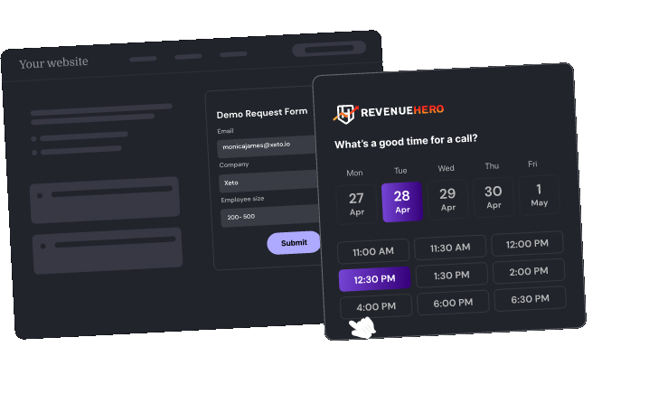
Step 1: Research RevenueHero's Existing Landing Page — Audited their landing page and identified conversion leaks: static hero image, weak visual hierarchy, CTA wasn't prominent, mobile was desktop-shrunk, no motion or interactivity, too many navigation options diluting focus from "Request Demo".

Step 2: Define Key Objectives — (1) Increase demo requests via conversion-focused layout + CTA optimization. (2) Improve mobile UX with separate mobile designs. (3) Add visual appeal through Lottie animations (hero, hover states, social proof). Decided to focus on motion design to show "progress = meetings being booked".

Step 3: Redesign Landing Page — Hero section with Lottie animation showing meetings being booked in real-time. "Request Demo" button bigger, clearer, and above the fold. Interactive hover cards with Lottie animations. Customer logos with Lottie scroll animation. Separate mobile version (not desktop-shrunk).

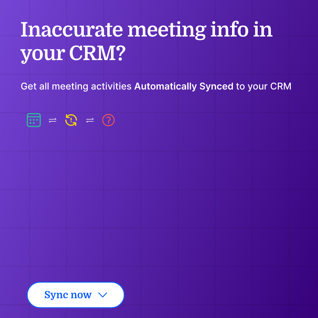
Step 4: Design Ad Set 1 (CRM Sync Benefit) — Brief: "Inaccurate meeting info in your CRM? Get all meeting activities automatically synced to your CRM." Desktop version: clean layout, product UI screenshot showing CRM sync. Mobile version: vertical layout, bigger text, mobile-optimized CTA.

Step 5: Design Ad Set 2 (Visual Storytelling, No Product UI) — Brief: visually show that RevenueHero books more meetings without using product UI. Used a visual metaphor: calendar filling up with meetings. Lottie animation showing meetings appearing in real-time. Desktop + mobile versions.

Step 6: Create 4 Lottie Animations — (1) Hero animation: meetings being booked in real-time. (2) Hover cards: interactive motion on hover. (3) Ad animation: calendar filling with meetings. (4) Customer logos: scroll animation for social proof. All exported as Lottie JSON for web performance.

01

Task 1: Landing Page Redesign (Desktop + Mobile)

Redesigned RevenueHero's landing page to increase demo requests.

Key changes: (1) Hero section with Lottie animation showing meetings being booked in real-time. (2) "Request Demo" CTA bigger, clearer, and above the fold. (3) Hover cards with interactive Lottie animations for engagement. (4) Customer logos with subtle scroll animation as a trust signal. (5) Separate mobile version—designed mobile-first, not desktop-shrunk.

Goal: If someone lands on this page, they should understand the value in 5 seconds and know exactly what to do next (request a demo).

Figma assets may take 1–2 minutes to load from CDN. Please wait if you see a blank or loading frame.

Figma Prototype — Landing Page

Task 1: Landing Page Redesign (Desktop + Mobile) media 2

Lottie — Hero Animation

Task 1: Landing Page Redesign (Desktop + Mobile) media 3

Lottie — Hover Cards

Task 1: Landing Page Redesign (Desktop + Mobile) media 4

Lottie — Customer Logos

02

Task 2: Ad Set 1 — "Inaccurate Meeting Info in Your CRM?"

Designed Meta/LinkedIn ads highlighting RevenueHero's CRM sync benefit.

Brief: H1 Copy: "Inaccurate meeting info in your CRM?" | Description: "Get all meeting activities automatically synced to your CRM"

Key design decisions: Desktop version — clean layout, product UI screenshot showing CRM sync, clear CTA. Mobile version — vertical layout, bigger text, mobile-optimized CTA. Platforms: LinkedIn, Facebook, Instagram.

Goal: Highlight a specific pain point (inaccurate CRM data) and show how RevenueHero solves it (automatic sync).

Figma assets may take 1–2 minutes to load from CDN. Please wait if you see a blank or loading frame.

Figma Prototype — Ad Set 1

03

Task 3: Ad Set 2 — "More Meetings Booked" Visual Storytelling

Designed Meta/LinkedIn ads showing "more meetings booked" without using product UI.

Brief: Visually show that RevenueHero can book more meetings on the sales reps' calendars. Constraint: no product UI—pure visual storytelling.

Key design decisions: Visual metaphor — calendar filling up with meetings. Lottie animation showing meetings appearing on a calendar in real-time (reinforces the outcome through motion). Desktop + mobile versions optimized for each platform.

Goal: Show the outcome (more meetings booked) through visual storytelling, not product UI.

Figma assets may take 1–2 minutes to load from CDN. Please wait if you see a blank or loading frame.

Figma Prototype — Ad Set 2

Task 3: Ad Set 2 — "More Meetings Booked" Visual Storytelling media 2

Lottie — Ad Animation

Takeaways

What changed once the work met reality

What didn't go as planned

01

How do you show "more meetings booked" without product UI?

Task 3 required showing the outcome without using product UI. I used a visual metaphor: a calendar filling up with meetings in real-time, created as a Lottie animation. Lesson: visual storytelling beats product screenshots. Instead of showing the tool, show the result. Motion design reinforces the outcome.

02

Mobile-first design vs. desktop-shrunk design

Most B2B SaaS landing pages fail on mobile because they're desktop-shrunk—same layout, just smaller. This creates friction: text too small, CTAs buried, navigation cluttered. I designed for mobile first: bigger text, prominent CTA above the fold, simplified navigation with a single goal. Lesson: mobile-first design isn't desktop-shrunk design.

03

How much motion is too much?

Lottie animations can enhance engagement, but too much motion = distracting and slow page load. I used motion strategically: hero animation shows progress, hover states only trigger on hover (not auto-play), social proof has a subtle scroll animation. All animations exported as Lottie JSON (lightweight, fast load). Lesson: motion should reinforce the message, not distract from it.

What shipped

Redesigned Landing Page with 4 Lottie Animations

Redesigned RevenueHero's landing page to increase demo requests: hero section with Lottie animation (meetings being booked in real-time), hover cards with interactive Lottie animations, customer logos with scroll animation, and a separate mobile version designed mobile-first (not desktop-shrunk).

4 (Hero, hover cards, ad animation, customer logos)

Lottie animations created

Separate mobile design (not desktop-shrunk)

Mobile versions designed

Designed 2 Ad Sets (Desktop + Mobile for Each)

Ad Set 1: "Inaccurate meeting info in your CRM?" — product benefit, CRM sync, product UI screenshot. Ad Set 2: visual storytelling showing more meetings booked without product UI — calendar filling with meetings via Lottie animation. Each ad set optimized for desktop + mobile across LinkedIn, Facebook, Instagram.

2 (CRM sync benefit + visual storytelling)

Ad sets designed

LinkedIn, Facebook, Instagram (desktop + mobile)

Platforms optimized for

Outcome

What shipped and what it proved

3

Tasks Completed

Landing page + 2 ad sets

4

Lottie Animations Created

Hero, hover cards, ad animation, customer logos

2 sets × desktop + mobile

Ad Formats Designed

Meta/LinkedIn ads optimized for each platform

3

Mobile Versions Designed

Landing page + 2 ad sets (mobile-first, not desktop-shrunk)

3

Figma Prototypes Delivered

Landing page + 2 ad sets (all with desktop + mobile versions)

What came next

This was a speculative portfolio exercise exploring how motion design + conversion optimization can increase demo requests. Key learnings: 1. Motion = Progress: Lottie animations show "meetings being booked in real-time"—reinforcing the outcome through motion. 2. Mobile-first design ≠ desktop-shrunk: Design for mobile first, then adapt to desktop. 3. Visual storytelling > product screenshots: Show the result, not the tool. 4. Conversion-driven layout: Every element drives toward one goal (request a demo). I'd love to apply this approach to real client work—designing landing pages and ads that convert, not just look pretty.

2026 — Kelashik.